Biok Dermatology
100% natural and 100% effective – that’s BIOK Dermatology. This brand is based on a new philosophy of the creation of dermatological cosmetics. It perfectly combines natural, active components approved by scientists and chemical ingredients which are being used in pharmacy for ages. High efficiency of the final product is being achieved exclusively by professional usage of natural components in the formula of it. Such innovative and balanced solutions required respective branding and packaging to accompany them.
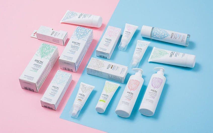
A package of each product includes unique ornaments which altogether come in abstract shape of a leaf – an obvious symbol of nature. A colour of it differs products one from another. This graphic element takes up to 50% of the package space to provide and strengthen the exclusiveness of the packaging and differ these products from the competitors. Customers can get a message about innovative naturalness from the first sight as the visual is an easy-to-read metaphor about natural ingredients combined with scientific precision.
The most of the area of the package layout was dedicated for information about product. The name of the product and an easily adaptive short description took their place on the front of the package. As it is known that the target audience, people with dermatological problems, tend to choose thoroughly, it was decided to take a maximum effort of the other area of the package and put arguments which validate the efficiency of the products. All these design and information placement solutions were brought with one goal – to communicate the philosophy and long-term strategy of this innovative, scientific, yet natural brand.